

View from the kitchen sink, where I should oftener be.

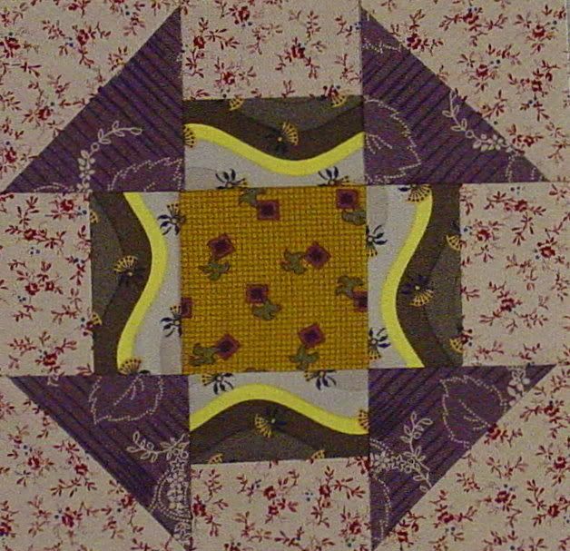
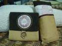
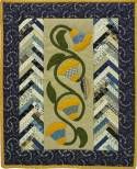
This is an advanced level Dear Jane block; definitely a challenge. After sewing and unsewing, got it done only to realize at last that there wasn't much contrast. Did this one and like it much better. So I'll have quite a nice block in my Orphan Block collection.

Hey, have you all seen the Flickr album for group photos of Paducah?
http://www.flickr.com/groups/paducahquilts/
I have been trying to locate the online streaming site that is filmed at the Paducah show...can anybody send me the link? I've googled every possible combination I can think of and no luck. You'd think there would be a link on the AQS website but if it's there, it is eluding me.


17 comments:
LOLOLOLOL..."Where I should oftener be!!!" I am so going to print that up and frame it!!!
The DJ block is something else!! What a challenge!
Wow! Your blocks are so perfect! I've redone mine and it's still kind of wonky. Good job!
Love the view from you kitchen sink and our DBJ blocks! They are perfect indeed. Did you paper-piece B6?
Sorry, something is wrong with the y on my keyboard...! I meant to say your kitchen sink and your DBJ blocks...!
Yes the second block with the sharper contrast is far better - after all its a shame to put in all that work and then not be able to distinguish it properly
Wow. I love that view.Your blocks are neat! Enjoy looking at all your stuff. Haven't been in a week or more it seems.
that is a great view. love the plants. i love both blocks - even though i understand what you mean about the low contrast one. sometimes i think it's fun to have an incredibly difficult block blend to the point of almost becoming texture.
What a lovely, peaceful view.
I'd say that is an advanced block! Then I think the whole Dear Jane is just beyond me *s*
That second block is stunning. I'm not even going to try to count how many pieces and you did it twice!!
Both blocks are beautiful... and I think we ALL do that - pick fabrics at times that are so similar in hue and with not a lot of contrast. But the first block IS lovely, as is the second. You'll use it someday!
Keep up the good work,
Caron in Michigan
http://blog.caronmosey.com
Great block! I'm sure it was worth the time and patience. Don't you hate that--making a block and then realizing the fabrics you picked aren't quite right? I just figure it's my "practice" block. Still, I like them--even the first one with lesser contrast is lovely!
Your second block is definitely better contrast. And to think you made that block twice but I think you will be happier with it.
Love your blocks. Yes, the second one has a better contrast, but they are both beautiful!
I'm going down the Dear Baby Jane list of participants looking at their blocks before I post my latest ones. And I have to say yours are the best. And really mine line this one is awful. I tried to follow another blog's directions and ugh it isn't like yours! Nice job. You make me sad though when I look at mine ;-).
Really like the second block!
OHHHHHHHH!!!!!!
Wonderful!!!! The second one is better....you're right!
I can't think when I'll have to do this block...it looks impossible to me!!!
WHAT a gorgeous view from the kitchen sink! Mine faces the wall, but I don't exactly spend a lot of time there....
Post a Comment